We know how to navigate
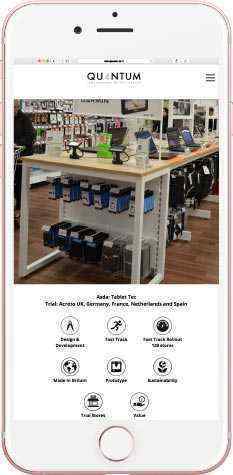
Seventy9 ensures all traffic browsing and flowing through your capital site is fully maximised for smaller devices, mobile and tablet, whether a fully responsive solution with automatic adaptation to the size of the viewing screen, or a bespoke mobile version of the main website.
We make sites concise and quick to load, optimising images, stripping graphics down, creating and building responsive sites designed for touchscreen navigation and smaller screen sizes, acknowledging and interpreting the different browsing habits employed by users of mobiles and tablet devices; reading far less, scrolling much more, spending less page time across the site. If you're looking to circumvent Google's active penalisation of unfriendly mobile websites, or to increase your conversion rate and reduce your bounce rate across different devices, then get in touch!
